Saturday, February 02, 2008

Digital Designs for Scrapbooking


I'm reading Renee Pearson's book "Digital Designs for Scrapbooking 2: Making Your Own" and would love to get her first one but it's out of print and apparently hard to find. You can find it in the Amazon Marketplace for like $140!!! How crazy is that?! I checked on eBay and they're expensive there too. I didn't see one that sold for less $40. It originally retailed for $19.99. Anyway, book #2 is about making scrapbooking elements yourself, which is kinda cool. I'm going to sit down and go through it at the computer where I can try out the stuff as I'm going.

Digital Scrapbooking 5


I do tend to like the stuff put out by Simple Scrapbooks but this one didn't quite live up to the expectations I had after reading the books affiliated with Simple Scrapbooks. Two of the three free kits were no longer available and the other one I already had (Scrapgirls). But again, I'll be looking to the layouts for inspiration.

Designing with Digital


Published by Autumn Leaves

I felt like this was more of a layout idea book than an actual learning tool. They have one or two sentence "directions" on how to apply different techniques but I'm not sure how helpful that would be if you're just starting out. And if you're not just starting out, then you probably already know how to do the stuff they're suggesting. I'm trying to think if I learned any new techniques...hmm...I think most of the stuff I was already familiar with. But no doubt I'll be doing some scraplifting. :)

A Designer's Eye for Scrapbooking

by Ali Edwards


This book features more intricate layouts than the two books affiliated with Simple Scrapbooks, that I just reviewed (The Big Picture & Clean & Simple). This one is affiliated with Creating Keepsakes. I notice that Ali Edwards has designed some memory book templates for Shutterfly, which of course is my online printer of choice.

This is another book that I breezed through in a day. This was a very solid step-by-step introduction to design and layout. She explains how to make your pages flow, how to make them pop, how to use embellishments to enhance your pages, et cetera. I would say that most of the layouts in this book aren't my particular style but I still learned design concepts that I can apply in my own way. Although now I feel a little overwhelmed with so much to think about: white space, even margins, visual triangles, flow, charm, mixing fonts, balance and on and on it goes.

Now I want to go back and revisit some of my earlier page attempts and apply some of the concepts that I learned in this book. :) Anyway, I would definitely recommend it. I actually believe that more people are drawn to this more ornate style of scrapbooking than the simple, linear style that appeals to me.

Friday, February 01, 2008

Perfect Day


I'm feeling more and more lost as I read all these books...maybe I should stop reading. :) It was kind of nice being blissfully ignorant. I tried to incorporate some of the things I was learning but...I can't say I'm thrilled with the end result.

Anyway, I used a background from Katie Pertiet and another background from the Scrapgirls Refresh Kit (striped - turned it sideways). The fonts are JW Chalk Rubons (Scrap N Font?) and Girls are Weird (DaFont?).

Thursday, January 31, 2008

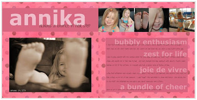
Annika


I applied some of the ideas that were suggested in two of my recent reads (Clean & Simple, the sequel and A Designer's Eye) but not actually a scraplift. The fonts I used were Verdana and Joyful Juliana (which I got from the Internet). The background paper is from Zazou.

Journaling:
I joke that Annika is my “Tigger girl” because she literally jumps around the room. She’s a delight. She’s full of life. She’s fun. She jumps up and down for joy. She’s a very happy little girl.

I was playing around with my camera while the kids were upstairs for “quiet time”. Annika came downstairs and asked me to take her picture. She had changed into her swimsuit...with about 6 plastic swim diapers on top of the bottoms. So I obliged and took a whole slew of photos of her.

Later that afternoon Oskar had swim class (by coincidence). When I told her to get dressed, she asked if she could put her clothes on on top of her swimsuit. I said "sure". She proceeded to cheer and dance. She yelled, I'm so ess-ited!" She informed me her dance was about swimsuits and clothes.

When we got to swim class, she stripped out of her clothes and wanted to swim. I love my bubbly and enthusiastic little girl.

Posted by Picasa

Designing with Photos

by Alison Tyler Jones & Donna Smylie


This book has nice photos and some good tips but for the most part I think it's pretty basic...in terms of technique, anyway. Or perhaps it's just that I'm *that* skilled a photographer. *hehe* The second part of the book was about using your photography for crafts and that part didn't really do it for me. I guess I'm too focused on scrapbooking right now. And while I think they did touch on that, as I recall it wasn't really my style. Having said all that, I enjoyed reading it and immediately rushed off to take some inspired photographs. But in terms of technique, the Understanding Exposure book will probably be a better resource tool for me.

Wednesday, January 30, 2008

Clean & Simple: the Sequel

by Cathy Zielske


This book definitely speaks to me. Cathy's style is right up my alley - I love it. In fact, it's funny because this evening as I was reading the last couple of pages, I came across a design that she scraplifted from an Amex ad...which, if you read back on this blog, I just did two days ago. *hehe*

I thought The Big Picture addressed the philosophy of scrapbooking in a general way and I would say this book is more focused on design . Cathy and Stacy Julian (author of The Big Picture) actually work together at Simple Scrapbooks and they share a similar approach to the art of scrapbooking. So the books complement each other nicely.

All of the design is pretty high level but I still found it helpful and informative. I took a graphic design class in college...or at least I started one...but the only thing I remember is the difference between serif fonts and sans serif fonts. I think I actually had to drop it for some reason or another. At any rate, this book touches on some simple rules of graphic design including white space, margins and fonts.

I'm walking away from this with some new ideas and techniques to try out and feeling very inspired. At some point I'd love to take another design class. (And I'd like to get the first Clean & Simple now...not to mention a subscription to Simple Scrapbooks magazine.)

Tuesday, January 29, 2008

Things I Hate About Pregnancy


I redid my pregnancy page. When I tried to use the tablet the first time, I was having issues (I write too fast, apparently). But I've discovered that the calligraphic brushes (as opposed to the basic brushes) seem to work better for me so I redid it with the tablet...instead of the handwriting font...which I'm not totally sold on. (It was a fun exercise but I didn't do a very good job with it...and now my trial's expired.) Anyway, I added some journaling with Century Gothic but otherwise everything is is the same. Scriptina (from the Internet) at the top and my handwriting for the rest.

Monday, January 28, 2008

playing at the park


Stole the layout from a dominomag.com ad. The fonts I used were Monteuideo and Angelina (which I got from the web...maybe DaFont). I used Adobe Photoshop CS and my Wacom Bamboo.

Photoshop Shortcuts

I googled "photoshop cs shortcuts" and found a very nice cheat sheet at this site: Trevor Morris Photographics.

Amex


Here's my Amex page. Looks a little funky here with the white on white. Oh well. Um...used my Wacom Bamboo to write out my responses. Got the Amex logo off the web and then just copied the questions from a couple of Amex ads that I found in a magazine (Domino to be exact). The fonts are Times New Roman and Arial.

Posted by Picasa

Two Page Spreads

I don't think I'm going to continue to ALWAYS make two page spreads. It's not like you see very many two page spreads when you're flipping through a magazine. I'll still try to think about how the pages will look sitting next to each other but no biggie if it's not an actual 2 page spread. I'll make that something special. :)

[2/3/08 edit: Who am I kidding?! I'm still going to make two page spreads.]

Pregnancy


I finally have a new page. Woo hoo! The only thing that didn't originate with me is the Scriptina font at the top (which I believe I got from DaFont). The other font is supposedly my handwriting. :) Used Photoshop CS.
Posted by Picasa

The Big Picture

by Stacy Julian


I have to give this book rave reviews because it changed the way I'm going to approach my scrapbooking. For the most part this book was already in line with my thinking. But Stacy Julian freed me from the trap of feeling an obligation to scrapbook chronologically and to include all my best/favorite photos. That's always been a problem for me. I'm not good at narrowing down my photos and figuring out which ones to include.

After reading this book, it helped me to understand my purpose for scrapbooking and what I'm trying to accomplish. My scrapbooks are for my kids...plain and simple. They're for me too because I like to go back and look at the pictures and of course I enjoy creating them. But at the end of the day, my purpose is to help my kids understand who I was, how we all interacted with each other, what our lives were like and how much I love them. That's it. So with that in mind, I'm just going to let myself be inspired by photos and scrapbook the ones that jump out at me. Or if I have an idea for a page, I'm going to go back and find the best photos for that. For example, I'm just going to do a page about Oskar's preschool and include photos from various events...instead of thinking that I need to do a page for each preschool event. I'm also going to knock off those American Express ads and do a page like that for myself (you know...the my life, my card ads...Ellen DeGeneres, Tiger Woods, Beyonce Knowles, Tina Fey...et cetera).

I've always been sold on journaling. From my perspective, that's what makes scrapbooking special in the long run. Sure it's fun to try to make the pages attractive, but in 20 years, the most special thing about those pages will be those words that explain the significance of the photos. I don't think you necessarily need to have tons of journaling with every photo, but I think it's great to provide the context of the photo...which otherwise might get lost with time. So I'm going to refocus on telling our story, rather than thinking of my scrapbooks as our "photo albums". Instead I'll treat them sort of like my journals for the year. In 2008, this is what I was thinking. These were the photos I loved. This is something I enjoyed doing for fun. Or for the baby book, when you arrived, this is what I was thinking. This is how I felt about you. This is how you impacted our lives.

Here's a link to the site Stacy Julian created after coming out with this book.

Posted by Picasa

Saturday, January 26, 2008

BHG's The Ultimate Guide to Scrapbooking


This was my first digital scrapbooking purchase and I LOVE it. There are three different sections of techniques based on complexity and it walks you through these techniques with screenshots from Elements or CS. I love the layouts and have scraplifted several of them. I learned a lot from this magazine. I definitely recommend it. I wish it was something that came out regularly because I would subscribe.
Posted by Picasa

Understanding Exposure

by Bryan Peterson


I took a photography class in highschool and had a manual SLR at that time...but in recent years have gotten a little lazy with cameras that do everything for you. So now that I have an SLR again, and even though I *could* use the auto mode, I want to improve the quality of my photos. This book has been a great refresher on working with aperture, shutter speed and light. Plus the photos are very inspirational! As I'm reading it, I've been pulling out my camera to try different things and am having a blast!
Posted by Picasa

Photography for Scrapbookers

by Tracy White


I enjoyed looking at the photographs but didn't necessarily learn anything new in this book. But if you've been very much just a "snapshot" photographer and are wanting to take your photography to the next level, then this is probably a good place to start. There are some good tips. It's a quick and easy read (I read it the same evening that I bought it.)
Posted by Picasa

Sunday, January 20, 2008

hezro font


I made a font! Woo hoo! How cool is that?! I thought about sticking the .ttf on here to share but I'm not sure why anyone would want it. I was trying to make something that looked like my everyday handwriting. Unfortunately my everyday handwriting is a little too fast for my graphics tablet so I had to slow it down a little. But maybe before my trial runs out I can do a neater rendition. At any rate, it was a good learning process. At first I wasn't really getting FontCreator. It's actually very easy to use but I just didn't have enough time to tinker with it and figure out what I was doing. But today it came together. Of course I still have barely scratched the surface of what you *could* do but I think I have the basics now. I'm going to be sad when my trial runs out. I'll have to drop some hints about this as a potential gift. :)
Posted by Picasa

Friday, January 18, 2008

Mandy Mystiques

My friend sent me a link to this site: Mandy Mystiques.

I downloaded a trial version of FontCreator and started working on a font of my handwriting. But I haven't had time to finish it. I'd better get on the ball before my trial runs out. I'm not sure what I've been doing with myself lately and why I haven't had time to scrapbook. I think I've been watching too much tv (sports) with my husband. I need a laptop so that I can multitask! But hubby will be away all next week so I should have plenty of time for digital scrapbooking...or maybe not...come to think of it. :)

Saturday, December 29, 2007

Two Peas in a Bucket

How is it that I haven't visited Two Peas in a Bucket's web site? I've read about them time and time again and just went there and realized, "hey, this doesn't look familiar!" So check it out. Good site! Plus they have free fonts. Can't argue with that. ;)

Yesterday I hooked up my new Wacom Bamboo Fun! And it *is* fun. I haven't found the perfect brush for writing yet. Maybe just because it's an entry-level graphics tablet but when I write - especially cursive - it's a little blocky...or something (think connect-the-dots). So I need to figure that out. I was having better luck with one of the natural brushes than I was with the basic brushes. It's better if I use bigger brushes too, but that's not great for handwriting. So I need to play around some more. I already tried changing all the settings for the tablet and that didn't seem to make much of a difference. Maybe I just don't push hard enough??

Friday, December 28, 2007

Sale, Sale, Sale

Let me just mention that there are some great sales going on now and it pains me to not take advantage. But I haven't been working on any pages so I don't even know what I need. But Scrap Girls is having a 25% sale and Digital Freebies just had a 50% sale. *sigh* Designer Digitals had a huge sale too. I will remember this for next year! And in the meantime, I'd totally love to subscribe to this magazine.

Sunday, December 23, 2007

DaFont

Haven't done much scrapbooking lately. Been too busy suffering the ailments of pregnancy. *hehe* BUT...I just found a really cool site that I *had* to share with you: http://www.dafont.com/ Tons and tons of free fonts. Wish I'd found this site before I paid for fonts at other sites. *hehe* But that's okay. I like those fonts too and it's not like I've paid a lot of money for anything. Gotta love digital scrapbooking!!

Wednesday, December 12, 2007

Happy Holidays!


This isn't exactly scrapbooking but I used elements and a background from a kit that was posted by Cinzia Loosemore at www.digitalfreebies.com so wanted to acknowledge that. Thanks!

Saturday, November 17, 2007


Okay, I think this new page looks much better next to the Kiersten page...even if it's still not exactly a two-page spread.

Drum Page
Fonts: Title is LDJ Rock It font (my little joke); journaling is Century Gothic
Background: Papers are all from Kellie Mize's freebie kit for the Ad Challenge 11/11/07
Layout scraplifted from Bree at ScrapMaps. (I went back today to take a better look around. Definitely a great site!)

Kiersten Page (again)
Fonts: Title and background in photos is LD Letterpress; journaling is Century Gothic
Background: Red paper from Lisa Whitney's freebie Christmas collection; Brown paper from ComputerScrapbook (designed by Kristine Bents and Jessica Safty). It was part of their Romantic Rose pack but I'm not sure which one because I bought both packs. But this background is called Deep Violet. (I added the red tones to it.)
Posted by Picasa
Yippee, I just downloaded a background kit that goes perfectly with my "Kiersten" page so that's going to be a two page spread now. Woo hoo! Well, the second page will be about something else but it will look good next to my Kiersten page. I got the paper from Designer Digitals' Gallery. It's from one of their ad challenges (which I think is an awesome idea).

*Ad Challenge: They find an ad for inspiration and then create backgrounds based on the colors/designs of the ad. I remember seeing a bedding set in...hmm...a Pottery Barn catalog that I LOVED. If I ever see that ad again, I'll definitely try to create some matching backgrounds.

Brushes

I have a hard enough time keeping track of all the different elements that I use - to give proper credit - let alone the brushes. But I have brushes from:

Amber Clegg (ScrapArtist)
Jan Hicks (ScrapGirls)
Katie Pertiet (Designer Digitals)
Lisa Whitney (ScrapArtist)
Lori Cook (ScrapGirls)
Mandy Steward (ScrapGirls)
Melany Violette
Nancie Rowe Janitz (ScrapArtist)
Shalae Tippetts (ScrapGirls)

If you'd like more specific information, please e-mail me and I'd be happy to help you out.

Scrap Maps

Found a link to this site at Lisa Whitney's site. It's called Scrap Maps. Haven't had a chance to really check it out yet but looks pretty cool at first glance.

Friday, November 16, 2007

Fontologie

Found another cool site: Fontologie. You can make your own fonts. Plus they have freebies for you to download.

Thursday, November 15, 2007


Well, not a two page layout but these are the two pages that will go next to each other. Scraplifted my new page from Sprellen's Little Lamb layout. Background is Durin Eberhart's Watercolor paper, font is SBC Courtneys Journal and used Amber Clegg's Stamped Hearts.
Posted by Picasa


Well...I tried bookplates and staples and different colors...all kinds of things but this is where I've ended up for now. I'm going to stop tinkering with it unless I come up with some great idea. Here's what the journaling says, by the way:

Kiersten keeps me on my toes! She’s quick to get into mischief. I frequently find her sitting on the kitchen floor with the contents of a box of cereal spread around her. She loves to sit in the bathroom sink. One day she got up onto the counter and was pouring out maple syrup. Another day she shattered our glass bathroom scale and while I was trying to clean up that mess, she got herself stuck on top of my dresser. She loves to hide very quietly in our closet. This little girl is a character! But we can’t help but love her.
Posted by Picasa


This is an effect that I read about in my beloved BHG mag so I gave it a shot. Maybe this wasn't the right photo for it but I think it's a cool effect. I like what I ended up doing much better (see below). I actually really like the brown and red combo so I need to figure out how to make my layout work. I think I'm going to try making the circle smaller. I was looking at Chey's ScrapArtist Gallery for inpsiration.
Posted by Picasa


I couldn't find a layout to scraplift so I ventured out on my own...and realize I don't have a clue what I'm doing. *sigh* I'll have to post a picture of the cool effect that I tried doing (Dwight told me it looked like an Old West Wanted poster). Anyway, I used a red background from Lisa Whitney (the red paper) that was in her freebie Christmas collection and I used a background that I got today from ComputerScrapbook (designed by Kristine Bents and Jessica Safty). It was part of their Romantic Rose pack but I'm not sure which one because I bought both packs. But this one is called Deep Violet...although I added the red tones to it. (One of the papers from the Romantic Roses pack is available for free at ComputerScrapbook...such a clever marketing ploy. *hehe*) Fonts are LD Letterpress and Century Gothic. If anyone has suggestions for how I might make something out of this, shoot away!
Posted by Picasa

Wednesday, November 14, 2007

Have I already mentioned Designer Digitals? That's another good site. They nice freebies too.

busy, busy, busy


Okay, background papers are ones I bought when I was paper scrapping (and then scanned the other day): Kiwi Flower, Kiwi Stripe, Tangerine Medley and Tangerine Stripe. The paper under the pictures is Gillian Hurst's Rustic Crush Special (I lightened up the color a little by putting a white and fairly opaque layer over top). There's a smidge of one of Durin Eberhart's green Watercolor papers showing. The swirls are from a Swirls brush set by Jan Hicks. Scraplifted the design from one in my handy dandy BHG mag (by Kim Haynes). The font is Courier new. I think that about covers it.

I'm hoping that I'm learning some things with all this scraplifting that I'm doing. If not, I guess I'll just be scraplifting ideas 'til eternity. :)

[2/2/08 edit: just redid the design. I need to add a credit for the font LDJ Mother's Typewriter because I changed the font on the left.]

Posted by Picasa

Tuesday, November 13, 2007

Freebies

Today I've been all over the place downloading freebie digital scrapping supplies. There is tons of stuff to be had. Of course that means I've also done a little shopping but the good thing is that digital scrapbook supplies are not very expensive so I haven't even spent $20...and I've done a fair bit of shopping.

But let's get back to the freebies. I think I've already mentioned that I started at BHG's site. I like their digital scrapbooking section. Presumably there's a link there somewhere to take you to their freebies. But no matter what, they have tutorials, layout ideas, tips, and lots of useful information.

The next site I found was ScrapGirls. The have a big freebie kit plus I signed up for their newsletter which has a freebie everyday. I enjoy looking at the newsletter. It has layout ideas and there's always a little tutorial. Plus *I* think their designers are pretty good.

ScrapArtist is another site that I like and they have freebies too.

Somehow I ended up at ScrapNFonts. I signed up for newsletter and they gave me 3 free fonts for doing that (I'm getting a little addicted to fonts). I never realized that fonts can actually be fairly cheap. ScrapNFonts had a sale over the weekend and practially every font was $1 so I bought a couple. Then today I picked up a few more at ComputerScrapbook ranging from $.75 to $.99.

I stumbled onto those because Computer Scrapbook is another site with some freebies enticing you to sample their supplies.

You can get freebies from various individual blogs like Eclectic Thoughts or Simply Clean Digi Scraps or Scrapper's Muse et cetera.

And here's a site with various different lists including the best places for freebies. Haven't checked out all their sites but it looks like they actually have a lot of good info.

Anyway, the way I got started today was just by googling "scrapbook freebies" and that pulled up tons of stuff. It's crazy. Right now I'm actually choosing to stop looking around because there's just too much stuff. I'm tired of organizing all the stuff I downloaded. Plus in some of the kits I downloaded, I got some stuff that I'm not sure I would even use. I'm either going to delete it outright, or maybe just stick it in a category called "Not My Style" and then if I don't use it in like a month, out it goes. (I'm using ACDSee of course so my stuff is all categorized and cross referenced. Much handier than working with paper supplies!)

Oh yeah, I should upload my latest layout. I have to restart my computer to do that though because Picasa is acting squirly. So let me go do that. Actually, I'll do it tomorrow. Right now I'm going to bed.
Sunday, November 11, 2007


I added a second page. The design for page 2 was scraplifted from a design by Susan Cyrus in my BHG magazine again. I used the same heart embellishments and the same background paper. The striped paper is from Durin Eberhart at ScrapGirls. It's part of their freebie Refresh Collection. The font is AMC_Cute from Amanda McGee at Scrap Girls.
Posted by Picasa

Saturday, November 10, 2007

Fonts


I just finished taking inventory of my fonts. :) I pulled up my list of fonts in Windows Explorer and then typed up the list in Word. And then I changed each one to be it's own font, of course. So now I have a handy dandy reference guide to put on the magnetic board behind my computer monitor. (Because that's one thing Photoshop doesn't do, which is very annoying. I like that Word lets you preview each of the fonts right from the menu.)

scrapNfonts was having a sale and their fonts were all only $1 (as opposed to $3). So I got a couple of new fonts. I'm so excited! (Which is kinda weird...excited about fonts...)
Posted by Picasa


Scraplifted this page from a design by Kim Crothers in BHG's The Ultimate Guide to Digital Scrapbooking.

Font: LD Letterpress, JW ChalkRubons from Jen Wilson Designs

Digital Elements: Stamped Hearts from ScrapArtist

Paper: Erica Hite's Bump in the Night collection (changed the paper to grayscale)
Lisa Whitney's Cotton Pink
Posted by Picasa

Friday, November 09, 2007

Posted by Picasa


Scraplifted the essence of the design from Beth Johnson's "Fall 2007" which was posted at this cool site. The striped paper and alphabet are from Durin Eberhart at Scrapgirls. Flowers from Sande Krieger at BHG. I changed the color but background paper was from Lisa Whitney's site. These are all still freebies but I think tonight I'm actually going to place my first order at Scrapgirls. I'm going to buy torn edges...and a couple of other things. I think it's going to cost something like $2.5o for the torn edges so figured that it's probably more cost-effective to purchase the kit as opposed to trying to do it myself (and my grand total is a little over $10 so a shopping spree but not TOO crazy).
Posted by Picasa