Thursday, January 31, 2008

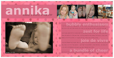
Annika


I applied some of the ideas that were suggested in two of my recent reads (Clean & Simple, the sequel and A Designer's Eye) but not actually a scraplift. The fonts I used were Verdana and Joyful Juliana (which I got from the Internet). The background paper is from Zazou.

Journaling:
I joke that Annika is my “Tigger girl” because she literally jumps around the room. She’s a delight. She’s full of life. She’s fun. She jumps up and down for joy. She’s a very happy little girl.

I was playing around with my camera while the kids were upstairs for “quiet time”. Annika came downstairs and asked me to take her picture. She had changed into her swimsuit...with about 6 plastic swim diapers on top of the bottoms. So I obliged and took a whole slew of photos of her.

Later that afternoon Oskar had swim class (by coincidence). When I told her to get dressed, she asked if she could put her clothes on on top of her swimsuit. I said "sure". She proceeded to cheer and dance. She yelled, I'm so ess-ited!" She informed me her dance was about swimsuits and clothes.

When we got to swim class, she stripped out of her clothes and wanted to swim. I love my bubbly and enthusiastic little girl.

Posted by Picasa

Designing with Photos

by Alison Tyler Jones & Donna Smylie


This book has nice photos and some good tips but for the most part I think it's pretty basic...in terms of technique, anyway. Or perhaps it's just that I'm *that* skilled a photographer. *hehe* The second part of the book was about using your photography for crafts and that part didn't really do it for me. I guess I'm too focused on scrapbooking right now. And while I think they did touch on that, as I recall it wasn't really my style. Having said all that, I enjoyed reading it and immediately rushed off to take some inspired photographs. But in terms of technique, the Understanding Exposure book will probably be a better resource tool for me.

Wednesday, January 30, 2008

Clean & Simple: the Sequel

by Cathy Zielske


This book definitely speaks to me. Cathy's style is right up my alley - I love it. In fact, it's funny because this evening as I was reading the last couple of pages, I came across a design that she scraplifted from an Amex ad...which, if you read back on this blog, I just did two days ago. *hehe*

I thought The Big Picture addressed the philosophy of scrapbooking in a general way and I would say this book is more focused on design . Cathy and Stacy Julian (author of The Big Picture) actually work together at Simple Scrapbooks and they share a similar approach to the art of scrapbooking. So the books complement each other nicely.

All of the design is pretty high level but I still found it helpful and informative. I took a graphic design class in college...or at least I started one...but the only thing I remember is the difference between serif fonts and sans serif fonts. I think I actually had to drop it for some reason or another. At any rate, this book touches on some simple rules of graphic design including white space, margins and fonts.

I'm walking away from this with some new ideas and techniques to try out and feeling very inspired. At some point I'd love to take another design class. (And I'd like to get the first Clean & Simple now...not to mention a subscription to Simple Scrapbooks magazine.)

Tuesday, January 29, 2008

Things I Hate About Pregnancy


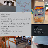
I redid my pregnancy page. When I tried to use the tablet the first time, I was having issues (I write too fast, apparently). But I've discovered that the calligraphic brushes (as opposed to the basic brushes) seem to work better for me so I redid it with the tablet...instead of the handwriting font...which I'm not totally sold on. (It was a fun exercise but I didn't do a very good job with it...and now my trial's expired.) Anyway, I added some journaling with Century Gothic but otherwise everything is is the same. Scriptina (from the Internet) at the top and my handwriting for the rest.

Monday, January 28, 2008

playing at the park


Stole the layout from a dominomag.com ad. The fonts I used were Monteuideo and Angelina (which I got from the web...maybe DaFont). I used Adobe Photoshop CS and my Wacom Bamboo.

Photoshop Shortcuts

I googled "photoshop cs shortcuts" and found a very nice cheat sheet at this site: Trevor Morris Photographics.

Amex


Here's my Amex page. Looks a little funky here with the white on white. Oh well. Um...used my Wacom Bamboo to write out my responses. Got the Amex logo off the web and then just copied the questions from a couple of Amex ads that I found in a magazine (Domino to be exact). The fonts are Times New Roman and Arial.

Posted by Picasa

Two Page Spreads

I don't think I'm going to continue to ALWAYS make two page spreads. It's not like you see very many two page spreads when you're flipping through a magazine. I'll still try to think about how the pages will look sitting next to each other but no biggie if it's not an actual 2 page spread. I'll make that something special. :)

[2/3/08 edit: Who am I kidding?! I'm still going to make two page spreads.]

Pregnancy


I finally have a new page. Woo hoo! The only thing that didn't originate with me is the Scriptina font at the top (which I believe I got from DaFont). The other font is supposedly my handwriting. :) Used Photoshop CS.
Posted by Picasa

The Big Picture

by Stacy Julian


I have to give this book rave reviews because it changed the way I'm going to approach my scrapbooking. For the most part this book was already in line with my thinking. But Stacy Julian freed me from the trap of feeling an obligation to scrapbook chronologically and to include all my best/favorite photos. That's always been a problem for me. I'm not good at narrowing down my photos and figuring out which ones to include.

After reading this book, it helped me to understand my purpose for scrapbooking and what I'm trying to accomplish. My scrapbooks are for my kids...plain and simple. They're for me too because I like to go back and look at the pictures and of course I enjoy creating them. But at the end of the day, my purpose is to help my kids understand who I was, how we all interacted with each other, what our lives were like and how much I love them. That's it. So with that in mind, I'm just going to let myself be inspired by photos and scrapbook the ones that jump out at me. Or if I have an idea for a page, I'm going to go back and find the best photos for that. For example, I'm just going to do a page about Oskar's preschool and include photos from various events...instead of thinking that I need to do a page for each preschool event. I'm also going to knock off those American Express ads and do a page like that for myself (you know...the my life, my card ads...Ellen DeGeneres, Tiger Woods, Beyonce Knowles, Tina Fey...et cetera).

I've always been sold on journaling. From my perspective, that's what makes scrapbooking special in the long run. Sure it's fun to try to make the pages attractive, but in 20 years, the most special thing about those pages will be those words that explain the significance of the photos. I don't think you necessarily need to have tons of journaling with every photo, but I think it's great to provide the context of the photo...which otherwise might get lost with time. So I'm going to refocus on telling our story, rather than thinking of my scrapbooks as our "photo albums". Instead I'll treat them sort of like my journals for the year. In 2008, this is what I was thinking. These were the photos I loved. This is something I enjoyed doing for fun. Or for the baby book, when you arrived, this is what I was thinking. This is how I felt about you. This is how you impacted our lives.

Here's a link to the site Stacy Julian created after coming out with this book.
Posted by Picasa

Saturday, January 26, 2008

BHG's The Ultimate Guide to Scrapbooking


This was my first digital scrapbooking purchase and I LOVE it. There are three different sections of techniques based on complexity and it walks you through these techniques with screenshots from Elements or CS. I love the layouts and have scraplifted several of them. I learned a lot from this magazine. I definitely recommend it. I wish it was something that came out regularly because I would subscribe.
Posted by Picasa

Understanding Exposure

by Bryan Peterson


I took a photography class in highschool and had a manual SLR at that time...but in recent years have gotten a little lazy with cameras that do everything for you. So now that I have an SLR again, and even though I *could* use the auto mode, I want to improve the quality of my photos. This book has been a great refresher on working with aperture, shutter speed and light. Plus the photos are very inspirational! As I'm reading it, I've been pulling out my camera to try different things and am having a blast!
Posted by Picasa

Photography for Scrapbookers

by Tracy White


I enjoyed looking at the photographs but didn't necessarily learn anything new in this book. But if you've been very much just a "snapshot" photographer and are wanting to take your photography to the next level, then this is probably a good place to start. There are some good tips. It's a quick and easy read (I read it the same evening that I bought it.)
Posted by Picasa

Sunday, January 20, 2008

hezro font


I made a font! Woo hoo! How cool is that?! I thought about sticking the .ttf on here to share but I'm not sure why anyone would want it. I was trying to make something that looked like my everyday handwriting. Unfortunately my everyday handwriting is a little too fast for my graphics tablet so I had to slow it down a little. But maybe before my trial runs out I can do a neater rendition. At any rate, it was a good learning process. At first I wasn't really getting FontCreator. It's actually very easy to use but I just didn't have enough time to tinker with it and figure out what I was doing. But today it came together. Of course I still have barely scratched the surface of what you *could* do but I think I have the basics now. I'm going to be sad when my trial runs out. I'll have to drop some hints about this as a potential gift. :)
Posted by Picasa

Friday, January 18, 2008

Mandy Mystiques

My friend sent me a link to this site: Mandy Mystiques.

I downloaded a trial version of FontCreator and started working on a font of my handwriting. But I haven't had time to finish it. I'd better get on the ball before my trial runs out. I'm not sure what I've been doing with myself lately and why I haven't had time to scrapbook. I think I've been watching too much tv (sports) with my husband. I need a laptop so that I can multitask! But hubby will be away all next week so I should have plenty of time for digital scrapbooking...or maybe not...come to think of it. :)